This project actually began shortly after the Persona 5 game was released, in roughly May 2017. I was watching my husband play the game and we talked about famous thieves throughout history and how they have been represented in pop culture. The initial idea for this piece is definitely his, he had a vision of Lupin vs. Persona and being that we’re both big fans of the Lupin the 3rd anime franchise it was a really fun side project. Unfortunately, May is an insanely busy time of the year for us as we prepare for our only fan-based event the Phoenix Comicon, so this idea remained a sketch for about 9 months. But then I worked on it on-and-off and we premiered the print at Phoenix Comicon 2018 (this year called Phoenix Fan Fusion).
Below I have listed some of the process and / or choices I made.
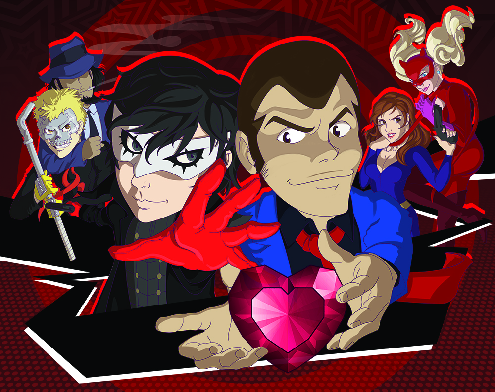
- Original Line Art
Sketching is my favorite part, I have loads of doodles and half finished sketches that never get made into anything. I think this sketch when contrasted with the final version shows a lot of the initial perspective and proportion mistakes I make early on. I try to correct these before I get too far but sometimes I don’t really notice it until I’ve put some distance between the initial sketch and additional work. - Blocking / Base Color
The colors are mostly true to their show representation. In retrospect I think Jigen and Skull would have been better behind Lupin to help balance out this composition. As it is the black and red are very one sided. As for the process, a lot of my digital coloring is pretty similar to a graphic design / Illustrator workflow but I do work in Photoshop. I like clean blocks so I tend to trace out these solid areas with the pen tool so I can create a clean selection later. - Refine the Lines and Shadows
During this stage I fixed Joker’s head, which was tilted sort of painfully. He looks a bit more casual and like his neck might contain less rubber. I also had the opportunity to explore creating shadows in Black and some fun line coloring. I wanted something that would be loud but play well with all of the red I was planning for the Background. - Design Elements
You can see in the final image I chopped off a lot of legs – I also ended up re-building Joker’s torso. I really liked the original drawing on this but I asked my husband (and I think he was right) the perspective on him doesn’t make a lot of sense given the relatively proportional limbs and perspective on the other characters. A supplemental reason for this decision was to emphasize the hierarchy – with the legs it was a little unclear where the viewer was supposed to look. But the black, ribbon-like, abstract, graphic element (that is similar to that within the Persona 5 game) leads the eye. I do think that the black ribbon on the left is a little too heavy, if I were to re-do this I might reverse this so that it’s heavier on the Panther and Fujiko side to compensate for how heavy in black elements the other side of the composition is.
All-in-all: super fun, probably put too much thought into this – but I learned more about digital painting, shadows, and colored line art. 🙂